Originally, my plans for this were to create a mixtures of historic structure photography with a combination with the inspiration of photographer Lewis Baltz. As shown in my mind map here of my intentions, I wanted to focus on ruins, going into the Waltham Abbey Gunpowder Mills and take "aesthetic" images of old war shelters and ruins by framing them head on.
Additionally, I made a post at the beginning of this project stating ideas for 5/7 of my shoots; 1. Churches, 2. Old houses and Cottages, 3. War Structures, 4. Wall remains, 5. Shops and pubs. Looking back at these initial ideas shows me just how much my work has developed across these short months. One of the key reasons behind the progression in this project would be the amount of research in which I done to complete the project. Firstly, the Image Bank was the first stem showing me different approaches. I think this shows a progression in not only my work in this topic alone but in my work in comparison to unit 1. Even though I didn't analyse all 30 images like I done in unit 1, I went into much more depth whilst also finding more photographers along the way which were useful in my project- for example I came across photographers such as Bernd and Hilla who subsequently ended up being one of the key photographers which helped the creation of my project. For example, their work combined with photographer Lewis Baltz showed me the importance of framing and composition. Personally, I now find taking photos in a head on approach is much more successful that taking them at an angle because across this topic it has taught me how when you take photos head on, it appears much more professional and looks much smarter- thus also teaching me the importance in the use of a tripod.
When looking at my first shoot, I am quite happy with the outcome as I managed to create framing in my images. However, it is very clear from my first two shoots that I went out to complete these before I had conducted any of my research so not as much thought went into these shots as I had liked to. Furthermore, I believe it was a good starting point but I think it was much better for me to have developed my research further before completing any more shoots.
Additionally, it was during the edited and write up stages of these first two shoots when I came to the realisation that I needed to extend my work further than just the initial ideas because otherwise I would have struggled to analyse both my photos and the photos which I thought worked alongside.
Therefore, when it came to my Research Log I came across photographers such as Jason E. Powell and Julien Knez who had actually taken photos in comparing old images with what those locations look like now. Which I found really intriguing- thus giving me the influence and idea to experiment with this as one of my shoots. However, after the completion of my first Old vs New shoot, I was really pleased with the out come and thought that these were really good and interesting ways in capturing manufactured buildings and the state they used to be many years ago compared to what they stand to be today. I then decided to complete 2 more shoots in this style. Even though explaining that I done 3 of similar shoots, it may not sound like I have made much progress, however between each shoot I discovered new history about the images I was finding in the museum and library which helped me analyse in terms of context because it showed me juts how much had really change, but also I was learning new technique skills for me to experiment with. For example, the experimentation of physical experiments I developed my exploration through printing the new and old photos and ripping them and placing them together- to create a new image including parts of the new images and parts of the old images.
As a whole, I would say my project from start to finish has progressed really successful in terms of photographers work who has helped influence my work alongside the work I actually produced. I am much happier with the photographs which I have in my final portfolio in this project than I think I would have been if I were to have just focused on buildings such as just churches and ruins. I believe that looking at my final project now that it is much more interesting than I originally had thought it would have been.
Tuesday, 25 April 2017
Connecting essay 5
This is an image taken by photographer Ryan Francis in which I find really interesting. Primark; An unethical shop which is known and somehow loved by hundreds of thousand people. Although much like all other shops, or buildings in fact weren't always there before and what many people avoid learning is what was there beforehand? Was is an old family shop which went out of business because people stopped shopping there? Either way, behind every modern building lies a story which was once standing but has now been demolished/ removed from new generation memories. Both of these images are both placed within Bristol which was "bombed so badly during the war" (as shown on the website I sourced the image from), thus showing how in placement of that destruction the modern world of exploitation of capitalism has been able to replace the damage instead. At first sight this image hold denotations of just being a new vs old image. However as already spoken about when viewing the context of how this is the place which was once damaged in the war creates connotations of horrible memories such as death of bombings are modernised instead of being remember in forms of shops- to earn money from the public.
This is an image in which I took during one for my shoots in comparing old images which I have sourced online and in the library and museum. Even though in terms of composition and positioning I find this one of my weaker images in those shoots, I still find the concept behind the image. In the older image (one at the top) shows a community of people on market day, but there are more people shown than there are stalls, showing the importance of these events. Although when you then look below at the image which I took you are able to see the extent of how the market has grown in terms of the stalls increasing in size, although now the amount of people who actually attend the market is much fewer than what it used to be. I find this an interesting idea because it therefore shows the audience the change in both societal attitudes but also the growth of other productions. Originally the local market was much of the things that there bought, there wasn't a local Tesco they could just pop into. But there is also a sense of social solidarity and community that has been lost though out the years, many people used to go to the market as a "fun" activity as a time to go out the house and spend time with their neighbours. Thus showing the key difference between now and then, people nowadays are much to busy to go out to markets, why would they if it would be a fraction of the price just a little bit further around the corner at the supermarket?
I believe that both these images connect with each other quite well because it shows a clear distinction between old images and what is in their place now. As a whole I find this concept really interesting because obviously not everyone would have been around the time when life was the way it was so to be able to have a comparison put together it can sometimes really put it into perspective to the audience just how much has changed and not just in terms of appearance, also how the behaviour and societal attitudes have changed.
Exam Blogger outline
Contact sheet
Will
evidence the breadth of your research.
Straight Images (as many as you wish to post)
Select the best images from the shoot that you
might wish to take further through editing
Work Record your Plans
for the shoot, What you hope to
achieve. NB (those first two sections
should be written before the shoot in order to help you clarify your ideas and
to ensure you have all that you need).
This is followed up by What I
actually achieved (with two evaluated
pictures - equivalent to the evaluation section of a work diary) In this
section you must record how you took the photograph in terms of camera settings
and the visual outcome (did you achieve the type of photographs you wanted,
what are the denotations and possible connotations associated with the images). Candidates are expected to use technical
language (e.g. depth of field, etc). What I am doing to do next (this might mean something that occurred
whilst doing that shoot that you want to develop or maybe even a change in
direction, etc). Clearly your final
shoot will not have a “what am I going to do next section”
Computer experiments -
·
Computer
experiments will demonstrate your ability to experiment with the medium of
digital photography… This is an important aspect of the AQA assessment
criteria. You will need to explain the
process used. You can do this with
screen prints and text or just use text only.
·
You
should evidence the photograph before and after the computer experimentation.
Physical experiments
-
Physical experiments will
demonstrate your ability to experiment with the medium of photography… This is
an important aspect of the AQA assessment criteria. The process involves the way a final print is
physically transformed and how the meaning of a print changes as a result of
the transformation. Physical experiments
SHOULD be recorded by scanning in the transformed print.. You will need to explain how the
transformation has changed the meaning of the photograph e.g. describe your
concept and the connotations associated with the print.
FINAL PIECES
Show the
images the best images that you have created in a single post. Ensure that the images selected work as a
series and are linked to the exam paper.
Describe
how the work is linked to your preparatory work (i.e. photographers research or
shoots)
Final Evaluation
Here you will need to summarise how
your work has developed as a result of the shoots that you have undertaken.
·
How has your
research (photographers research, research log) and preparatory shoots influenced
the final series of images that you have created?
·
What have learnt/
how has your work developed as a result of the project, this can be:
o technical
(learning new techniques in camera operation, shooting)
o aesthetic (new ways of presenting work)?
· How successful were you in responding to the exam
paper? Identify areas where your work is strong and areas where you might want
to improve your work further
Monday, 24 April 2017
Connecting Essay 4
This is an image which is taken by Robert Adams which I find really interesting. As mentioned in my Photographers Research blog on my research of Adams, his work underlines the movement defined as the New Topographics, who's work is also combined/ similar to the work of photographers sch as Lewis Baltz. For this particular image, I really find the simplicity of the work very interesting. This is because many passers by of this location by think- juts another building site lets carry on walking- with no specialities. However, the way Adams has positioned the image in really intriguing because it has created a depth of field effect, the wooden part is in the foreground which at first is the main focus of the audience, although in the background the audiences eye move across and find quite an empty bit of land with a couple houses on. I think this is an important image in part of Adams series because the main idea/ reason behind his shoots were to show the audience the damage in which industrialisation is having on landscapes. In the case as shown here display it shows how the building of houses is damaging landscapes- taking away the beauty and replacing it with homes.
This is an image which I took for my second shoot of ruins and the history of Waltham Abbey. When I first presented this image, I was asked why I didn't just take the image of the church, leaving the wall out of the frame, to which I responded with it shows two different part of history in one image. When you research the wall as shown in this image, it used to be a wall which surrounded the whole church grounds and on the right of me when I was taking this picture was the gateway to enter Waltham abbey, although as it is clear here the wall is no longer complete due to the time it was built in. So I decided to have the wall in the foreground because I believed it created depth into my work because I was able to gain another element to my image of texture. If I were to have step to the left a little bit and cut out the wall, the texture of the church wouldn't have been clear because of the distance it is from me. Therefore in a picture of the church I wanted to show the age and historic mark that it does actually have on Waltham abbey
As a whole, I have already mentioned in my photographers research the impact and influence in which Robert Adams has had on my project. I do believe that these two images connect really well together because they both hold the depth of field element. Even though one is showing a building work in the foreground and the other is a wall, I still believe it holds the same connotation of showing the difference- the first image by Adams displays the damage that things such as building is having on the landscape whilst my image shows how something which used to surround the church in protection has be damage through the extent of factors such as the war and the public/ council not taking care of the ruins so has slowly been lost and decayed away and is now ignored and forgotten much like what will happen to the location in the image by Adams as slowly houses will scatter across the land taking away that natural beauty.
Connecting Essay 3
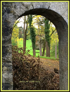
This is an image which I have found online which I find really interesting. This is because the photographer has captured the frame of a ruin which looks potentially quite old and dirty, yet this is "run down" appeal to the image is masked through the rest of the image, the photographer has used the arch to frame the other side, it is almost as if it is another world in comparison to what the audience are presented with in the foreground. Another aspect which I think is quite interesting is the fact that this photographer has actually decided to take the image at a slight angle rather than having a head on image, however this may have been because it the photographer did do this, there wouldn't have been these trees in the shot, thus losing the effect that this image does actually have. Furthermore, I find the use of colouring in this image quite interesting because the framing used by the arch is quite "bland" and boring being a general grey colour, although when you look deeper in the frame the audience are presented with bright green- environmental life as opposed to historical decay.
This is an image which I took for my first shoot of ruins. I chose this image as one of my strongest images in that particular shoot because as a whole I am really happy with the outcome. Originally, my main intentions was purely to get a photo of the ruins of the wall, however, when looking at the location, I thought it was so much more interesting when taking this photo if I were to focus on the tree in the framing of the arch as well. This is because the "burnt" colouring of the bricks are contrasted with the greenery in the frame. As the composition of the image was focused on being head on,it is almost as if I edited in the tree, it appears to be a gateway into another land. I find this image has quite good symbolism standing alone as an image because the wall which frames this image is quite damaged due to the age of it, but then at first glance people may suggest this is contrasted by the life of the tree, however, the trees in the background would be quite old as well- obviously not as old at the wall but they are not newly planted trees, thus showing the life in this picture is actually a sign of age as well, just in another form.
I find that these images connect really well. Firstly, the main similarity is the use of framing, both images have almost created "images within images", which I find really interesting because its almost as if both images have created gateways/ edits of completely different places. Additionally, these images connect because of the actual content of what is in the photo image- they are both of arches which continue into an area with trees. Furthermore, the use of colour both help these images connect because of the colours of the arches being contrasted with the colour of the green in the frame of the image.
Connecting Essay 2
This is an image by David Sanger which I find really interesting and have used in my research log. This image was found in the series of images by Sanger labelled "facade"- defining as something which hides the truth. This image was taken in Canada, although the date is unknown this could reveal deeper symbolism to this photo than just being a red house. First of of with the denotation of this photographer framing this house with both the door and window in perfect aligning could have just been luck. However, the colour red can also symbolise blood; death. Perhaps the people who lived near this house were suffering a great loss or the area had just faced something devastating. Therefore, I think this is clear to be a good reason in order to include this image within my research for this project because I believe when looking at context of images such as this one, it can form greater meanings in the audiences mind- stories to below behind those closed doors, almost personifying the building itself which personally I believe is intriguing.
This is one of the images I have taken for one of my shoots.I think this is a really interesting image because of the composition in which I took it in. I didn't want anything other than the building front in the shot (although there is a gap on the left hand corner) in a head on framing. Another aspect of this image which I find interesting is the colouring, as you can tell, I haven't edited this particular image because I like the way the red doors are much brighter and stand out from the rest of the white building. Unfortunately, as this is taken down an alley, the sun wasn't on the building although was on the ground behind me, therefore it has created a reflection in the buildings window which I do not think is very effective because it meant I had to worry about trying my best not to get in frame- taking away focus from other factors like the framing.
I find that these two images connect quite well. Firstly, I think the main aspect which connect is the use of colouring. The image taken by Sanger is of a building with bright red bricks which is contrasted with the black door and railing, whereas my the colouring of my image is different it still has a similar effect, the white building is contrasted and shaped through the dominate bold colour of red in the doors. Another aspect I find that these two images connect together is the composition, both have been taken in a front/ head on style which I find really interesting because as already mentioned, this helps create parallel lines/ leading lines across the image and helping frame the photo. However, these image do clearly differ in the terms of age, the image by Sanger appears to be a much newer and modern building, this is also helped through the clear lighting and focus, whereas my image is taken of a quite a run down abandoned shop which hasn't been open now for many years. Though the reason behind this is because my project is of the history of Waltham Abbey so if I had taken an image which is pretty much identical to Sanger, I do not believe it would have linked very well with my project. Therefore I believe that both these images connect, thus showing how my research for this project has helped influence the outcome of my work.
Connecting essay 1
This is an image taken by Bernd and Hilla Becher what is shown in my photographer research. I really find the "barn" style of building really interesting. The main aspect of this image much like all the images above which I think stands out is the composition of this image because it is clear that they did not go to this building quickly take a picture and then walk away, it appears to be carefully framed. This would have been with a tripod- thus showing me when I come to shooting this project, I need to carefully frame the aspect I want to frame, make sure it is neat with the lines appearing to be parallel to each other. This way I believe it makes a much more interesting and intriguing image for my audience to look at. Even though as already mentioned my camera would be unable to frame a building like this especially where I am focusing my project on as all the housing are very close together, I wouldn't be able to go back far enough
This is an image in which I have taken myself. The main aspect of this image what I find interesting is the state it is in. I have never actually seen this open which leads me to believe it is empty and has been for many years now. As you can see at the top of the building their is a crucifix, implying this is a place of worship, a very small church, yet perhaps due to a lack of funding it was unable to continue opening. Furthermore, this building is very much forgotten about in Waltham Abbey, many people do not even know that it is there which I find quite interesting in itself. Another aspect to this image which I find intriguing is the composition- I have captured a clear amount between each side between the edge of the frame and the building. I find the building itself quite interesting because if there was a lack of a Christian symbol I wouldn't have thought this to be related to a church. When I first saw this building I originally was lead to believe it was a shed, until obviously I saw the cross.
I believe that these two image connect really well. This therefore shows how Bernd and Hilla helped influence the work of this project. Firstly, the key connection between these two images it the building which is in the frame. They both appear to have a "barn-like" appearance, even though neither of these are actually a barn. Additionally, as the image of Bernd and Hilla was part of my research I already had in my mind the composition in which I wanted to try and recreate and I believe these images strongly connect in terms of the composition. For example, even though the image I shot is of a much smaller building, the structure of space around the building in the frame is very similar to the spacing around the frame. Even though Bernd and Hilla's piece is in black and white and this verision of this image is not, when I edited this image in black and white, it was so similar to the image above. Although I wanted to present my image in colour in this particular post because I wanted to show how even though these images do connect, I wanted to have may own influence on the work as well.
Sunday, 23 April 2017
Physical Experiments
For this project, I didn't want to do too many physical experiments because from previous experimentation I do not think they work as well as other experiments such as computer experiments. However, I did have an idea for my Old VS new shoots. In order to create this I printed out the new and old images which I took/ gathered and ripped them up together and placed them together to make a new image with components of both images- almost making a collage/ joiner. At first I was going to use glue to stick them down together, although I thought this would have looked too neat, I wanted a messy finish, so therefore used sellotape on the edges, again, I didn't do this neatly so before I put the sellotape on I stuck it on things to make it a bit dirtier and then I didn't stick it down flat so it gave it a more older effect. As a whole I am really happy with these experiments I hope to recreate them in my exam because I believe they are a good way of displaying the change. For example, the first one of the church shows the difference of location through time due to the conditions it faced during the war and the second image shows in change in terms of technology such as transportation-cars.
Thursday, 20 April 2017
Subscribe to:
Posts (Atom)