Saturday, 11 February 2017

Photographer Research; Lewis Baltz

Lewis Baltz was a visual artist who was born in 1945 and died in 2014. Baltz series documented the effects that industrialisation has on different landscapes. His work joins work such as Bernd and Hilla Becher in the New topographic movement- this is a term to define the work of photographers such as Baltz and Bernd and Hilla who's aesthetic is very similar in terms of both the composition and the colouring- the simplicity of mainly black and white imagery. It is suggested that his work resembles other photographers work but in addition works in similarities to painters such as Frank Stella and Donald Judd in terms of the aesthetic in which they create.

This image is very minimalistic which is clearly as already mentioned which I personally find really intriguing because there isn't much distracting the audience. I also find the camera framing/angle really interesting. Baltz has taken this image at a narrow framing so the audience cannot see the entire of the building, yet you are still given enough to figure out that it is a very run down building. Furthermore, as the angle is head on, it is clear that this image was taken on a tripod as the leading lines in the middle of the image of the ladder are perfectly straight. Additionally, I find it really interesting how Baltz has shown a transition of colour in this image, starting on the left the wall looks really dark yet it is hard to work out whether it is this colour due to shadowing or paint, then are the image spans out, there is a light transition as the image becomes brighter. I think this is really interesting because when looking at the other work by Baltz, they have mainly been over exposed in this manner which I think works really well because it could be argued that Baltz wanted to create irony within this particular image. As this appears to be a run down building passers by may look at this image in a more "dark"/ negative light, however this image "puts light"/ positivity on something normally ignored and pushed aside. 

This is a second image by Baltz which I find further interesting in the work of structures because the editing has been used in this image to raise the contrast- the trees in the middle and on the right are much darker than the surrounding building. Much like the image above, you as the audience are able to see very little of the building, just one side of it. I think this is a really good and intriguing aspect of taking images of structures because Baltz has shown that you do not have to see the entire building to gain a view. However, it is also symbolic especially with this particular image because this image appears to be at the back of a building however who is to say what the front of the building/ other sides look like? This could actually be a really nice building, Baltz has just taken one aspect of the building to form the stereotypical view of a derelict building. This can therefore be symbolic because the angle Baltz has taken this image is of a narrow angle, implying he is signifying the narrow-minded view of people in today's society, they only look at one aspect of something and build up a view on that part whilst ignoring the rest of the information. 


I decided to choose this image as well to analyse because I believe this style of photography would be really interesting to explore within my coming project. This is because Baltz has really thought about the composition and framing of this image, focusing on centralising the door with the rest of the frame at quite minimal, which personally I find really affective. Personally I believe this image really links well with the intentions of Baltz of showing the industrialisation damaging landscape because you can see this image hasn't be kept. One of the stereotypes of spare time many years ago for the working class would have been gardening, this is where the stereotype for if you had a tan you were considered working class because you spend more time outside. However, as time has progressed, there has been less time for things such as gardening. Which is relevant to this particular image because it appears to be over grown and un kept. Furthermore, I personally do not like shadowing across my images, however this one has two lines of shadowing across the building which could account for symbolic reasoning- for example, no one has been present in this house for many years and there fore has became abandoned.

This is one of the older images which I found for Lewis Baltz which I find really effective because much like the other images in his series the minimalistic approach to this composition can hold a massive effect upon the audience. For example, the bold colouring within this image is really interesting because the wash out effect has given this image a contrast, showing the difference between the white door/ building and the blacked out window and wooden frame above the door. Another aspect of this image which I find really interesting is the position in which Baltz decided to take this image, he could have framed the image so it was just the front of the house, however he decided to have the broken and destroyed up land in the foreground third which I personally find more effective because it gives a bigger insight to the audience for the atmosphere of the "run down" effect. It is clear that through the use of blur and composition the audience are able to build a perspective of the surrounding location- this wouldn't be situated in a "wealthy" estate, it would appear to be part of the working class estate.

Influence and summary...
Much like other photographers I have researched, the style and composition has been the main/ key factor in influencing my work because much like the work of Baltz here, it showed me when I went out to complete the shoots to keep in mind the angle I take the images in. For this image I have presented above displays how researching Baltz had an influence on the outcome of my work because, if you look at the final image above, I took several images such as this one presenting the front of a house. However, I was un able to complete the image exactly like Baltz because I weren't able to walk back any further because this was down a row of houses either side and if I went back any further, I would have been in the opposite houses garden.

Photographer research; Bernd and Hilla Becher

Much like Andreas Gursky, Bernd and Hilla Becher were German photographers, the three actually studied photography together which is why in certain cases their work interlinks, showing their working together has influence one another. The composition of Bernd and Hilla's work definitely interlinks with the work of Gursky in terms of having a head on framing of structures. Using a documentary style they are most famous for capturing images of industrial buildings. I have chosen to use Bernd and Hilla to research because I believe their work will help influence my work massively in terms of the shoots I hope to take of shops and ruins- using the same composition. Another aspect of their work which I find appeal is the way they have chosen to present their work, sometimes they present them as standing alone images, other times they place images together, in almost a contact sheet format, of the same buildings just different angles. 

This is the first example which I wanted to show because as mentioned above it is one of the ways they decided to display their work. It is a photo of very similar buildings in terms of shape and size yet are different in the terms of windows that are in the wall, the are of one of the front of the house one of the back of the house. I think this is really interesting because much like the work by Gursky that has already been analysed, you are able to personify the buildings through the symbolism which has been created in this photo. For example showing the saying of "everybody has the same structure (a skeleton) but are different on the outside". In relation to buildings, the differences could represent wealth/ social class. for example, the more windows could symbolism a high social standing with more money as there would either be more rooms or the rooms would be more "open". Whereas the top row of housing has very little windows which could imply they are of a lower social class as when the houses were being built they couldn't afford as many windows suggesting inside these houses it would be more close in/ claustrophobic.

Much like the image above, these images are presented in the same way, they are of different buildings in very similar sizes but all have different effects on the audience which are transitioned across the final image. Therefore, as this has a very similar effect as the one above, it shows how the symbolism of personification is very similar as well. Thus showing how the main aspects of Bernd and Hilla's work is creating symbolism through only the use of structures, which personally I think is such a good and interesting idea because instead of having images purely of a building with no more insight not meaning anything else, it is much more interesting for the audience to read into the symbolism. Therefore influence my ideas for this project- perhaps I could take photos of different houses and compare them in similar ways.

I personally find this image interesting because it shows a really old and run down looking building. Even though my camera wouldn't be able to take photos wide enough to get the whole building like this without distorting the final image- it would create a fish eye distortion unlike this final image. An aspect of this image which I do find quite interesting is the composition of the building in the frame, they have been able to position the building very central in this photo having very similar distance between the edge of the building and the end of the frame. When looking at this image originally, it doesn't look very special, although when you look harder at this image, you can see the difference in the location, implying the saying of " rich land surrounding in seas of poverty". In the background in the left top hand corner, you can see a building which appears to be either higher up because it is on a raised bit of land up a hill or it is a taller building its self, however the building in the background appears to be a much more wealthy building contrasting the main standing building we see in this image. I therefore find this image very symbolic because it shows not to judge something at first sight, someone may see this image and automatically be lead to believe that this is a low income "slum-like" area with building where people have to share homes, however, this is not the case because in the background reveals that it is not all housing which looks like this.  

This is the final image which I wanted to include in the research for Bernd and Hilla because I really find the "barn" style of building really interesting. The main aspect of this image much like all the images above which I think stands out is the composition of this image because it is clear that they did not go to this building quickly take a picture and then walk away, it appears to be carefully framed. This would have been with a tripod- thus showing me when I come to shooting this project, I need to carefully frame the aspect I want to frame, make sure it is neat with the lines appearing to be parallel to each other. This way I believe it makes a much more interesting and intriguing image for my audience to look at. Even though as already mentioned my camera would be unable to frame a building like this especially where I am focusing my project on as all the housing are very close together, I wouldn't be able to go back far enough. 

Influence and summary;
Much like Gursky, Bernd and Hilla have massively helped influence my shoots. When looking at the composition they used when taking photos of buildings massively helped influence my work because it showed me that if I focus on a side of a building, an audience are able to work out/ build a personality for the building. In my case in the image above, I used the composition of head on the front of a post office centralising the post box. Also, the style of photography also helped influence my shoots, even though the images of Bernd and Hilla are very likely to be black and white due to the times of them being taken, I still liked the idea of making my images black and white following the theme.

Photographer Research 1; Andreas Gursky

Andreas Gursky is a German photographer who is mentioned within the exam topic of "manufactured structures". His work varies in locations such as 99 cent stores, to just the front of housing flats. However there is a running theme in the style of the images- he creates a "front on" affect where the use of a tripod is very clear and the alignment of the framing creates aesthetically pleasing images to look at. Personally, the main appeal of Gursky work to me is the positioning of the subjects/ objects within the frame creating a deeper symbolism which is missed at first glance- something in which I hope to create within my work in this project. Originally, Gursky worked as a taxi driver whilst his parents worked in the photography profession- he didn't want to follow their footsteps; though later on in his career, he studied photography with Bernd and Hilla- who's who also relates to this project- thus showing the influence they had on one another.
This is one of the images by Gursky which I find really interesting because to me this holds so much more symbolism than just a picture of windows and balconies. Firstly, I think this image is interesting because of the framing Gursky has done on the building. To be able to take an image like this, it appears that he was in a tall building opposite this one. This has a much better effect on the image rather than if he had taken whilst standing on the floor and looking up- it wouldn't have been as "neat". Additionally, I find this image has symbolism because each window and balcony is the same in the term of style and size. However, when you look at each room you can almost personify the rooms- giving them a personality even when there aren't people in every room. We can build this symbolism through the positioning of chairs. For example some balconies have only one chair- perhaps they live alone. Other balconies with two chairs are all positioned differently as well. Some are facing each other and some are looking out towards the Gursky. This can be used to frame a personality as well because the chairs facing each suggest a sociable aspect- they sit outside to talk to one another, whereas the chairs which face outside the balcony imply they sit out there together admiring what ever it is in front of them. Another aspect to this image I find appealing is the colouring, even though this is entirely down to Gursky- he has found a building where the curtains within each room contrasts in colour with the white building. I find this image useful in influencing my project because it showed me to try experiment with a head-on position in order to create an image which is pleasing to look at. 

This image was taken in Hosel 1984. I have found that this style of photography- the head-on framing, was more consistent within Gursky older series; in the 80s. For this particular image I think it is really interesting because if you were to search Hosel in Germany, it appears to be quite built up, though at the point of this image, you can see the making of buildings- this appears to be a building site. Many photographers may have taken images of the building inside- the creation. However as Gursky has taken an image of the incomplete wall building I think it is really interesting because it shows the creation rather than the outcome. Further more, Gursky has chosen to share this image, even though if he had waited a couple seconds later, the people wouldn't be in the frame, so clearly showing that Gursky preferred having subjects in the frame. Someone may see this image and think that the photographer was too impatient to wait until the passerbys leave the frame. Although personally I think the use of the subjects make this particular image symbolic as it shows they aren't paying any attention to this building- much like many people, if a building doesn't have anything to do with them, effect them, they will just happily pass it by. However I think this building looks very intriguing because it appears to be in the middle of being built yet the state of the bricks look quite old creating a distinct between new and old, perhaps this is an old building in the middle of being re done.   

 
This image was taken in Kirchfeldstrasse 1980 and was the oldest image on the website that I found for Gursky. Even though this image isn't a "head-on" effect like the other images in this post I still find relevance in this photo. This is because Gursky has create an image which appears to be in a very small room in a quite run-down building, however this contrasts with what comes up when you search this place. This implies within the last 30 years it has been done up, but before hand it looked really run done, much like it does in this particular room. I find this image interesting because even though as already mentioned it appears to be run down, there is contrasting the old and new, much like other images in Gursky's work- the window frame and ledge looks freshly painted but the rest of the wall looks much older and in need of a new "touch".

This image is of Passport Control in 1982 and is part of Gursky's series of "Desk Attendants", which I personally find really intriguing because even though this is directly focusing on structures- it is focusing on the subjects, I personally think the structure of the booths can be read as quite interesting structures alone. Yet again this is another example of how Gursky's work has influenced my project because it shows the head on effect, if Gursky had taken this image from an angle and the subjects had to turn their head slightly, I do not think it would have the same effect because the framing of all the different lines would be off. It is almost as if this is a reflection of one side, however the only difference is the different attendant. 

Influence and Summary...
As a whole I believe Gursky is one of the key photographers which helped influence the work within this project because I have been able to use the techniques such as the composition of a head on factor within my shoots of buildings such as my door shoot and my shop shoot (as shown in the example above of an old police station building). One of the other techniques that Gursky's work has helped influenced my work with is the use of lighting; most of Gurksy's work is quite light and over exposed a little bit, which is why I wanted to go out and do these shoots when it was a bright day, so I could naturally take similar images in terms of the lighting. Gursky has also helped my project as a whole in showing the use of symbolism through the composition in causing personification of the different buildings.

Photographer research: Robert Adams

Adams follows a very similar style of photography than Lewis Baltz being a part of the New Topographic. His images capture the regional transition including the suburbanisation. His series were conducted across a number of years- much like a longitudinal study which is one of the key factors explaining why I decided to chose his work in my project. As a whole, I believe his work links really well with the rest of the photographers I have already studied.

When I originally looked at this image I found it resembled a horror image, however, the more I look into the image the more I find interesting about it. I think this is a clear example of the New Topographics work because the composition included and focused on in this image is very intriguing because the use of thirds have been clearly used, the foreground third is the garden, the middle third is the house and then the top third is the sky. When taking this image Robert Adams had several different options, he could have just taken an image zoomed in to the house, or used the house and just the foreground of the garden. However, he has decided to use a zoomed out effect which I find really interesting. This is because the house itself act as a leading line as it transitions across the frame. Another factor which I find relevant to analyse it the use of Henri Cartier- Bresson's term of the decisive movement- if Adams had taken this shot a moment later, the subject shown in the image may not have been turned in this way. Furthermore, another aspect which I find a running theme across images such as Adams, is the use of framing in the buildings which I find really interesting because it is almost framing a completely different image itself. For example, this image is mainly focusing on the building it self, although if you cropped around the frame of the window, this could have been a completely different image holding a different context altogether, which therefore I find a really interesting approach.

For this image, I find that it relates so much to Bernd and Hilla Becher's work because of the framing of the building. Firstly, much like all the other images within this series of his work, the composition is key in the framing for the final product, focusing mainly on the biggest structure in the centre but at the same time including smaller parts of the surroundings much like what frames Bernd and Hilla's work. The reason I decided to include this particular image in my work for this project is because I find the context really intriguing because of the style of photography, the audience are able to build an image on the surrounding location. Caravans as a whole are either associated as a holiday for the working class, or very low income families home. I think the combination between the run down building in the background with the roof falling off joined with the caravan presents a run down, slum like area.

Personally I find that this image is really interesting in showing the development in society because it shows how land is becoming overtaken with homes rather than being kept for wild life. For example, if adams would have taken this image of the surrounding without having the building part of a new house in the foreground, I do not think the audience would be able to work out what is happening, it would only appear that there are a couple houses on some land. However, as Adams has used depth of field- having something in the foreground- the building part of a house, with the rest in the background I do believe it is really effective. Furthermore, I decided to include this in my analyse for this photographer because even though most of the work that relates to my intentions for my shoot are minimalistic images, although this one is much more in depth and I still believe it works just as well.


I find this image really interesting because I think that this would be a very marmite effect image. Some people may look at this image and think that is a very boring, box standard image of just an everyday house. However, I believe that this image shows how not only does this photographer link to the work in which I wish to produce in this topic but also how the influencing photographers work actually link together because this image is also very similar to Bernd and Hilla Becher's work as shown on my previous photographers research. Firstly, I find this image interesting due to the composition, Robert Adams has frame the house with the same dimensions all around the building which I do think is very successful. Additionally, even though Adams does't have any control over the building itself, I believe that this building works well as the positioning of the windows in comparison to the door is interesting and well done.

Influence and summary
Personally, I believe that Adams did have have similar influences on my project than the other photographers such as Bernd and Hilla but also Baltz. For this particular image, I believe it is most similar to the third image I have displayed and analysed in this blog post. I think therefore The influence Adams has had on my blog is massively revolved around the composition of the framing.

Friday, 10 February 2017

Research Log

Jason E. Powell
http://jasonepowell.com/albums/looking-into-the-past/content/us-capitol-under-construction-washington-dc/
This image combining "Washington under construction" is really intriguing and I believe it links really well with my chosen topic of historic manufactured structures but on certain shoots I hope to do a similar effect on comparing the old with the new- what has replaced what used to be. For this image, I found on the website that Powell found it quite difficult to line up together as the original image was taken higher up and as there wasn't anything for Powell to stand on he had to make it work as best as he could. This therefore is useful in showing me that when I come to shooting, I may find this as an issue which I will need to try and overcome- for example not doing it in this exact style and just placing the two images next to each other instead. This image is important to me personally as a photographer researching this style of work because I believe when looking deeper into the symbolism of this work, it shows how many people take buildings for granted now- no one cares about how these buildings came about, the amount of work that had to go into it to get to where it is now; even if people may see this image and just think it is of an old image on top of a new image, this therefore would have been the denotation for this image.

Julien Knez
http://www.deccanchronicle.com/lifestyle/040416/photographer-combines-old-and-new-photos-of-paris-to-bring-history-to-life.html?gImgId=259640
This image is very similar to the one above which I think is really interesting because it was taken by different photographers, this one unlike the one above how doesn't focus on how the building was made but actually what events used to take place in this place where people walk past every day without realising it. For example in this specific image, Knez has shown how in this part of town, there used to be war turrets- as a safety weapon, therefore the connotation of this would be displaying to the public how somewhere people walk past everyday, perhaps on there way to work, used to be the place of destruction- a gun having to be positioned there as a way to help the town fight back against enemies. Much like the image above, the work of Knez is therefore really useful in my research of my project because I would like to create though provoking  series of images which would make my audience "look again" at what things used to be like.

Michael Topley 
For this image, I find it much more interesting than just "a picture of old castle ruins". When you look at this image, you can create a story in your mind about what used to be. This is an image of castle ruins in England which I think is truly intriguing because even though the country is slowly becoming modernising- old buildings are beginning to be replaced with more updated buildings, there are still standing ruins left of the past. I think another aspect of this image which I like is the fact that Topley decided to only include a small aspect of the ruins, thus making the surroundings of countryside visible to the audience. I personally believe the countryside background combined with the standing ruins are so beautiful making it so interesting.

Douglas Scott
http://douglasscott.photodeck.com/media/54635d28-2674-11e0-8c11-c1c2bcb4e6c6-old-shop-front-in-bawtry-near-doncaster-england
When I found this image I was really intriuged because alongside hoping to capture new and old images, I also hope to get images of different shops/ pubs within my town, this is because most of the buildings in my town are listed buildings which means from when they were built, the outside can never change. Which even though I couldn't find much context alongside this image, I did find that it is from a small British town which I think is visible from the small footpath showing at the bottom of the frame- half of it is paved the other is cobbled stones which I think highlights the "small town" aspect. Furthermore, just from looking at this building, I think it is clear that it is a very old building and is quite likely to have been a pub the majority of the time of the building being around. Some of the audience may look at this image and think that it is quite boring as it is just an image of the front of a pub. However, I think different; this is such as intriguing building. This is because I believe it is possible for the audience to personify this building- the cracks along the top suggests this building to be of age; it has began to have wrinkles. But also the old style bold framing of the windows and doors have been updated by being painted. Also; even though the building itself wouldn't have changed, aspects such as the poster on the right hand side would have been a new aspect to the building.

Nigel Henderson
Even though this image is suggested to be taken around 1950s and I obviously cannot go back in time to take photos like this, I still thought this was useful in my research for this project because as mentioned before, most buildings in my town are listed buildings so the outside framework is still very similar to what it used to look like, for example old fashioned pubs (like the one above) but also shops and butchers. This particular image is actually really interesting because of the sheer amount of signs which are shown across the front of the building. Also, the audience are able to make a judgement about the difference in time back then and time now is really clear because if you zoom in to the posters, you can see the difference in money back then. I think therefore this image is really important in my research for this project as I would be able to show old fashioned building frames combined with modern day shops- modern day pricing which would counteract each other.

Kostas Styliadis

http://abduzeedo.com/node/74961
For this image, I couldn't find any context behind it however, I still wanted to include it within my research log because I think it is a different way of entering the mind of the audience. Some may believe this image just has the literal meaning/ denotation of a run down door which is in desperate need for a paint job. However, I personally find this particular image of a door to be so much more, it can hold and create a story. Doors are something which are used to hide something inside from people on the outside- "no-one knows what happens behind closed doors". However, when looking at the symbolism of a run down door such as this one could be used as a method of personification which I think is a really interesting and key way of interpreting a photograph of a building. For example, when I look at this door, I think that it has gone through so much, it is old and may have had so many different owners, gone through the whole colours of the rainbow, but at the end of the day it's just a door, a form of protection and isn't looked at any further.

Feije Riemersma
http://abduzeedo.com/node/74961
Much like the image above, I found this image on the same website so was unable to find any context behind the photo. However, I just found this image truly beautiful because of the simplicity it holds. Just by looking at this suggests to me personally that it is somewhere in a different country, somewhere hot. The reason I thought to include this photo was because I found the lacey effect of the balcony in eye catching as opposed to the simple patterns across the rest of the photo. This image has a very similar effect than the one above because many people may look at this photo and only see it as a picture of a door and no other specialities. However I think this door holds a greater symbolism- the wall framing the surrounding of the door is a dark "gloomy" colour which is contrasted by the bold colour of turquoise. This could be interpreted with what happens in this building isn't actually a nice place, it could be a place of suffering, however the bold colouring of the door combined with the life of a tree on the side could be the suggestion of a facade- a fake show that passers by could see these colours and think it is a lovely place, but really, only the people who truly know what it is like behind this door really know what it is like. Therefore I think it is an important idea for me for dedicate a series to doors because even though a door can tell one story behind the door is what is important.

Ryan Francis

http://www.rifemagazine.co.uk/2014/07/old-bristol-vs-new-bristol/
Primark; An unethical shop which is known and somehow loved by hundreds of thousand people. Although much like all other shops, or buildings in fact weren't always there before and what many people avoid learning is what was there beforehand? Was is an old family shop which went out of business because people stopped shopping there? Either way, behind every modern building lies a story which was once standing but has now been demolished/ removed from new generation memories. Both of these images are both placed within Bristol which was "bombed so badly during the war" (as shown on the website I sourced the image from), thus showing how in placement of that destruction the modern world of exploitation of capitalism has been able to replace the damage instead. At first sight this image hold denotations of just being a new vs old image. However as already spoken about when viewing the context of how this is the place which was once damaged in the war creates connotations of horrible memories such as death of bombings are modernised instead of being remember in forms of shops- to earn money from the public.

Justin Plukett

http://www.trendhunter.com/trends/justin-plunkett
Even though this isn't a "real" structure, I believe it fits really well with my idea of this project because Plukett has manually constructed this through editing techniques. The series which this image belongs with are a gloomy series of images with the intentions of "encouraging exploration and questioning" which personally I find really intriguing with photography such as this one. Therefore I think this image is relevant within my project because even though I will be approaching manufactured structures in a documentary style- not manipulating it in any way, I find the work of Plukett together with the hidden meaning is interesting for something I should include within my work. For example, bringing forth the questioning of what things where really like before us as an individual- what our grandparents lived like, what the shops used to be like. With this specific image, someone may believe it just appears to be a jumble of different buildings all placed together in a random order. However, this can lead to a deeper connotation when looking at the smybolism in which this image creates. The atmosphere in this image appears to be "desperate", in a slum like area. Perhaps this is what Plukett had intended- there are hundereds of slums around the world even in richer countries, they are just pushed aside and ignored, although if all the ill made buildings were placed together in a format such as this one- it may bring more attention, the buildings people are forced to live in are dangerous made of scrap materials for shelter; place all these buildings together then it would be even worse- raising the question of what is needed for something to be done about poverty stricken areas?

David Sanger

http://www.davidsanger.com/stockimages/6-460-8034.facade
I find this image really interesting when involving the context because this widens the connotations in which it creates. This image was found in the series of images by Sanger labelled "facade"- defining as something which hides the truth. This image was taken in Canada, although the date is unknown this could reveal deeper symbolism to this photo than just being a red house. First of of with the denotation of this photographer framing this house with both the door and window in perfect aligning could have just been luck. However, the colour red can also symbolise blood; death. Perhaps the people who lived near this house were suffering a great loss or the area had just faced something devastating. Therefore, I think this is clear to be a good reason in order to include this image within my research for this project because I believe when looking at context of images such as this one, it can form greater meanings in the audiences mind- stories to below behind those closed doors, almost personifying the building itself which personally I believe is intriguing.  

Thursday, 9 February 2017

Personal Project Image Bank

Marcus Buck

When researching manufactured structures a couple of similar images to this one appeared which I found really interesting because it holds a deep symbolism and connotation of a story that used to be there and has now through out the years has been lost. As you can see on the current standing building an outline of a building which used to be standing beside it yet has for what ever reason been knocked down. Looking at the location it appears to be a housing estate which I think is really intriguing when looking at this singular image because this photographer has frame his image very similar to the work of Lewis Baltz- on the side of a building and not including the whole structure, it creates a story and also a sense of nostalgia. People used to live in the house which is no longer there- spending day after day and night after night, where lots of the families memories would have been built and structured, yet just like that, the memories have gone- the house has gone. Another connotation which this image can convey is the idea that even though a building may look "perfect" and together when looking at the front, but when you walk around you can see some damage which can therefore can represent a "never judge a book by it's cover" notation. Below are two similar images by Marcus Buck which I think hold very similar symbolism and connotations to the one above.


Bernd and Hilla

The framing of this image is very similar to the one above, yet the editing style and appearance of this image appears to be quite a bit older. Therefore, between these two images, it can help my progress my work through historical connotations through my use of editing. I find this image aesthetically pleasing, which is due to the use of a tripod making it easier for this photographer to create straight lines through the windows and the edges of the structure. Another aspect of this image which I think is really interesting is the way the photographer has chosen this particular building, the windows follow each other in a pattern yet when looking closely at them, they are all different, whether it is the frame itself or what is shown in the window. For example the very top window is a small dark window, revealing nothing about the room that it belongs to, perhaps this is a loft window or a bathroom window- a privacy window. Then going down one window there is the same rectangular window as the two windows below, yet even though it appears to be a lit room behind the window, there is nothing on the window pain revealing what room this is. The window below this however has a faint silhouette of a house plant on the window board, thus suggesting an adult being present within this room, for example being a kitchen or sitting room. Then the bottom window appears to be much darker than the ones above suggesting the curtains are drawn closed perhaps being a bedroom and someone is sleeping. Personally, I think it is important when looking at images such as structures to look carefully at individual aspects as it can reveal a wider symbolic meaning- this one being even though everyone looks the same, appears to be the same, inside they can be completely different.  Below are similar images...


Unknown

This image is of the abbey in Netley- somewhere by South hampton, I find it really interesting because if you were to look at this from a religious point of view, you would find it symbolic are this photographer has captured the sun beams through the windows implying God is looking through, this is a holy place. Looking at the structure it self, I think it is really intriguing because it shows to me personally, an old historical structure which every though through the year it has broken a little, the structure is still visible which I really like. Another aspect of this image which I find particularly intriguing is the framing that this photographer has managed to create, this would have been taken with a tripod and the main focus to the audience is the central shape frame of the windows then alongside this the sun beams. I think this is a good way of approaching manufactured structures because even though the audience may want to see the whole building, the small factors such as these windows have a similar effect because it gains more focus on the smaller parts, for example the texture of the wall creating historic age- you can see the small details which went into the creation of this window alone let alone the entire abbey. There this image on it's own shows how structures such as old churches may be a "walk-past" normal standing building that you see everyday but if you think back, the effort and hard work that was put into the creation of it is of need of focus.
Image result for church windows photographyImage result for church windows photography

Unknown

This is an image in one of the locations which I intend to shoot in my first shoot near where I live which  I think shows a good example of what I intend to achieve, without looking at the whole church, this single image of the door shows a historic age to this building. Unlike including the entire building, I personally think this style is much better because as shown here, the photographer has framed the door so this is the main focus of the image, showing the swirls on the door and the bold brown colouring contrasting to the tea stained looking colour on the surround- implying it to be really old. When looking to create an old piece of work, you are likely to tea stain to to gain the similar colour of the church here which I think is really intriguing. Furthermore, I think it is important in showing the amount of detailed placed in the creation of this building by looking at the frame of the door, theres layers and I think it creates further depth when looking at this image. Below are two more images which show the same church which I intend to use as a main focus of my first shoot. Even though one of the images is a wide depth of field image, I wanted to show different aspects which I could choose to include. Furthermore, if I gain access to it, I think it would interesting to shoot a similar to the one shown below on the right because it shows the entrance of the church hall and I think this alongside the door above is really interesting in showing a historic facade of manufactured structures. This image may be quite accessible to take as the doors of the church are normally open when it isn't being used for events such as weddings. I also think if I were to take small factors of this church it would be a really interesting way of creating connecting images because my audience my look at all the images and in their mind be lead to gain a visual image of the whole building in their mind without actually seeing the whole structure.


Lucy Marston

The framing of this particular image is really interesting because Marston has decided to include half of a garage looking door combined with the brick work of the rest of the house. I think this works really well as a whole image because even though this isn't an image of an entire house, we as the audience are able to suggest in our minds that this house is a mix of "normal"- with the brick work combined with a modern touch. Another aspect of this image alongside the fact that she has used a head on approach for this building, the shaping formed through the shadowing is really intriguing because the use of shadows can be used to frame the window and also give a further insight into the shape of the part of the building shown on the right. I think this image/ the work of Lucy Marston is quite useful for me and the research of this project because it shows me how the use of whether can be used in my advantage in the creation of the atmosphere. As I aim to use historical buildings in this format, I believe the days I go out would massively hold an impact- whether it is sunny or cloudy. Furthermore, when looking at other aspects of her work, the lightness of the photos give it such a soft touch- thus making them aesthetically pleasing to look at; as shown in other examples of her work below. Its almost as if Marston's of framing creates an "image inside an image" perception, for example the windows or door frame in the below images could almost be photos of somewhere else which I think is a really intriguing part of her work.
Image result for Lucy MArstonImage result for Lucy MArston

Ed Freeman

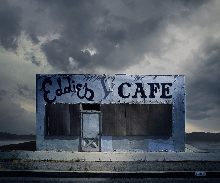
There's something that I find quite "cute" about this image because it looks like a dainty little beach hut, yet in the wrong location. I personally find this image really pretty to look at because Freeman has framed this structure in such a way in highlighting both the beauty of the building but also the breath taking view on the surroundings. For example, the bold highlight of white filling the frame of the building contrasts the "dull"/ darker tones of the surrounding location and even though I wouldn't be able to recreate this image in the time frame and money I have at this point in time, I still think it is very useful in my work research because as the combining aspect throughout this images show, the head on effect of structures help build such a beauty in the structure. A way I could use this in my work however could be that if I decided to I could take an image of something and use the same use of framing around the factor I choose. For this particular image, I think it works really well because it creates a soft aspect to the photo. Another symbolic aspect which I think is really intriguing is the fact Freeman  has formed an isolated atmosphere yet still holds the beauty- you don't need to have lots of people/ buildings around you in order to stand out, I personally think this building standing alone is really beautiful. Below are two other images which were taken by Freeman which again I think are truly strong standing images- capturing structures almost in the middle of no where.
Image result for Ed FreemanImage result for Ed Freeman

Henri-Cartier Bresson
Image result for henri cartier bresson
when looking at the image above I find it really interesting as Bresson has captured not only the structures around him but the decisive moment. This is the idea that when taking a photo, that specific moment in time can never be recreated, it is at that point that one time, if the photo was taken a moment later, the subject would be either in a different position or out of the frame. In terms of this image, I think it is really interesting because the use of the shadowing helps create a shaping in the structure. Additionally, I find this image intriguing because the black and white editing effect has created an image where nothing takes away audiences focus. This use of editing has also ensured the audience are able to get a feel of the texture created in the buildings.


Image result for henri cartier bressonImage result for henri cartier bresson

Matthieu Venot
Image result for matthieu venot
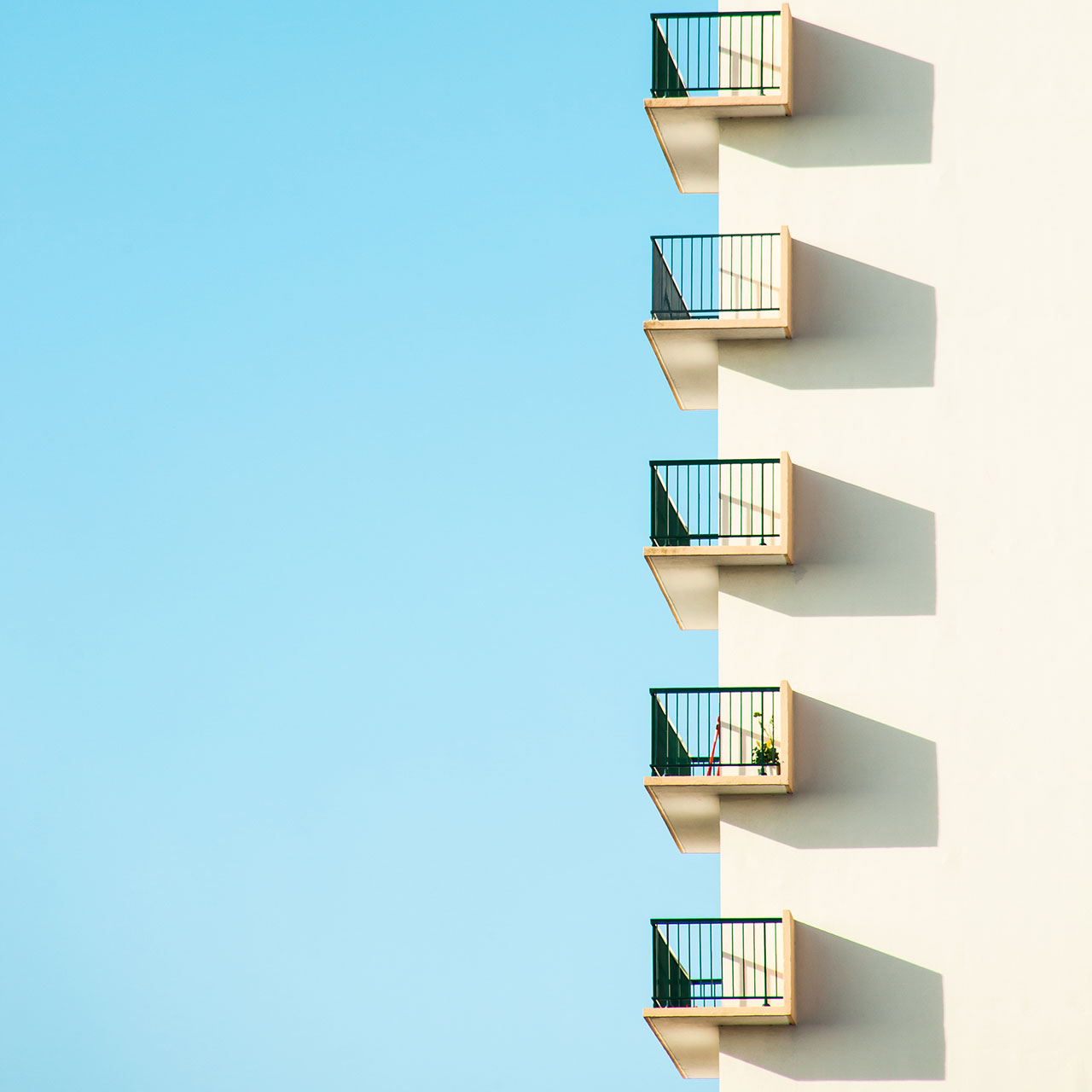
For this particular image above by Venot, I find it really interesting due to the pure simplicity in the formation of different shapes alongside the contrast in colours- with the majority of the frame being blue- the sky is strongly helps form the shaping of the building structure of balconies. Much like other images I have researched before, I think that Venots work forms a beautiful symbolism which may not be clear at first sight. For example resembling the image shown above  each balcony would belong to a different person, with a different personality and I believe that even though there are no visual subjects within this image, you can build a slight difference in balconies- although unlike other images taken in the series by Venot, this difference is much more subtle, the second balcony from the bottom of this frame has a a touch more colour from items being put on this particular balcony, plants. As a whole, I decided to use this image within my image bank because I believe it is a interesting way in capturing manufactured structures in a personifying approach- giving the building life. Below are more in depth examples of Venots work- showing more detail as opposed to just a side view of a building. I find this series as a whole really beneficial for my project because it shows me personally that even if I take photos from different potions- at first sight the images may not appear to be a running series but when looking deeper into the symbolism of the images they all interlink together.
Image result for matthieu venotImage result for matthieu venot

Raymond Erith
Image result for raymond erith
I find this image really interesting when looking as older manufactured buildings- which is my main frame-line for this project. Personally, I decided to use this image within my image bank as I find the framing of the building striking- the photographer Erith has positioned the building perfectly direct in the centre of the frame which I personally find really intriguing. This is because this gives the image/ building both depth and form through shaping and tone. As it is clear that the sun is on the right of the building is has formed a slight transition of lighting from the highlighted side on the right to the shadow side on the left. This use of tone in natural lighting has therefore made it easier to create depth of field in the shape of the building, for example the shadowing shows the audience that this building is of a circular form. Another aspect which I find really interesting about the image above is the way Erith has been able to position the building so that the short path creates a leading line to the main door thus helping the depth. I decided to use Erith within my image bank because I find that both the image above and the images below link quite well with the ideas in my mind of the historical photography of buildings in which I intend to shoot throughout this project.

Image result for raymond erithImage result for raymond erith

Andreas Gursky
Image result for andreas gursky buildings
Andreas Gursky is one of the photographers within the exam paper which I believe work is really interesting and creates benefits of my ideas. This is because even though I am not actually taking photos of buildings such as the one above, I find the perspective of the building really intriguing. This is because as mentioned above, Gursky has been bale to show symbolism between each window- personifying the building, giving each window a sense of personality and life even if there is no subjects directly in the frame. Gurskys work therefore has benefited my ideas for this project because it has given me examples of a "head-on" examples which I believe in my work would work the best.

Image result for andreas gursky buildingsImage result for andreas gursky buildings